“You don’t write the truth. You write what people say!”
— “Absence of Malice” (1981)
Techniques of contextualizing deconstructed elements of stories have the great advantage of avoiding stenographic journalism like that criticized in veteran editor Kurt Luedtke’s script for the 1981 film “Absence of Malice,” which definitely should be on the watch list for anyone interested in journalism.
Instead of relying on what people say about things, we can use real-world examples of the impact on actual, everyday people by humanizing stories and by adding storytelling rather than decorative visuals. Even more important, perhaps, we can get past political spin and make facts that otherwise would seem to bounce off our consciousness like meaningless details relevant and informative via charted data.
Both techniques allow us to avoid being merely an echo chamber for opinions and to create something other than commoditized content. In the age of myriad news and social media sites that play and replay the same old stuff, this is a way for us to stand out as an originator of valuable content not available anywhere else. That, in essence, is the ballgame in terms of success or failure as a news medium.
Most of our reporting courses do a fine job of introducing students to the need for finding human faces in textual or video stories. We probably need to do a bit more work about determining how to inject such storytelling into still visuals. However, the biggest gap in most young journalists’ education is in aggressively seeking to find stories via numbers, as David McCandless demonstrates in his TED talk above.
Yes, it’s true there are many in the world who regard truth as a malleable concept and who deride factual presentations as “lies, damned lies and statistics.” But part of the reason for this is that journalists, never known for their numeric literacy, do such a poor job communicating numbers, often falling victim to unscrupulous numbers spinners, that it’s difficult to trust what’s reported. The global news agency Reuters decries this in one of its reporting guides, which begins with the equation: “Numbers plus reporter equals error.”
We cannot, however, simply avoid the challenge by sticking with simplistic numbers out of context then decorating them up with various artistic techniques. We need to challenge ourselves to dig deeper and find ways to tell stories and to visually present those stories. The evidence about the power of visual storytelling is simply too great.
Take, for example, the 2007 Poynter Eye Track studies, which compared the effectiveness of three versions of the same newspaper page:
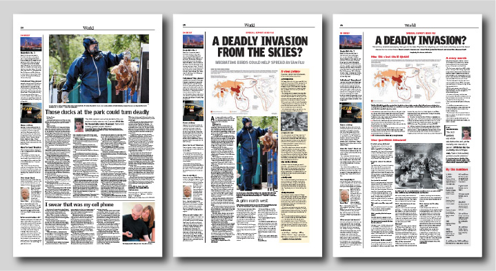
The page at left contained a linear narrative story with a not particularly storytelling photo — just something that showed what a passage within the story looked like. The middle one deconstructed the story more nonlinearly, adding more entry points of a factual nature. The right one eliminated linear narrative story text entirely, replacing it with largely statistically based factoids and data visualizations. Even though the visualizations weren’t especially good, the results were clear. After different readers were exposed to different versions of the page, a test of how much information they retained was administered. In aggregate, comprehension and recall increased dramatically the more the story employed techniques other than linear narrative.
This is the power of deconstruction, and one of the best ways to wield it is with contextualization in the form of visual representation of data.
Some stories are almost impossible to tell adequately without such techniques. The current pandemic is perhaps one of the best examples. This clearly is a numbers story with human faces, yet far too often we report numbers without clear context, without appropriate visualization and without adding human faces. We’re content to be mere stenographers of public pronouncements, and if that is all we do, nothing sets us apart from myriad other sources of information conveying exactly the same material.
So how do you accomplish more than this with a group of student journalists who, if they liked numbers more, would by north of Gregory or south of Green rather than hanging out in the innumerate middle of our campus?
The same way you get to Carnegie Hall as a musician — practice.
Take, for example, this rather simple set of data drawn from the university’s Campus Profile, a website every DI staffer ought to be fully familiar with:
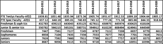
Use the download link or click the table to download the data in Excel. Play around with the data, as we did in class Sept. 25. Within it are hints leading to stories — and some leading to dead ends. As data detectives, your job is to learn how to separate the potential wheat from the potential chaff. We played with these numbers a bit Sept. 25 and showed you how to start being a data detective with them. Your assignment for Oct. 2 will be to find some other story, and clear evidence for it, from elsewhere within the Campus Profile, and post a note with evidence of your findings to the Data category.
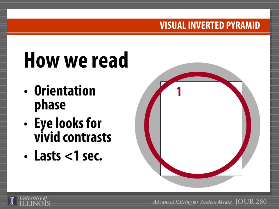
We also talked a bit Sept. 25 about how to present such data when they are found. Here’s the Powerpoint presentation discussed:
Begin thinking about not only what data to find but also about how it potentially might be presented and include a brief summary of that in the item you post for Oct. 2.
Finally, in a second assignment for Oct. 2, please separately post a thorough critique of the Sept. 28 print issue of the Daily Illini. Post it in the Critique category of this site. You’ll have to change from “Data” to “Critique” in the “Categories” menu at right during posting. We’ll review those critiques in class Oct. 2.