Analyzing an issue

We’re going to do another critique of the DI for this week’s class, but this time we’re going to do it with some key questions to answer, and we’re going to apply those questions to both the Monday issue and the Thursday issue. So critique both, and make sure you answer these questions when you post your comments in the Critique category of this site:

Metrics confirm that readers are most likely to appreciate stories that are somehow unexpected.

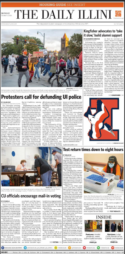
Are these four stories the ones that are most likely to somehow surprise readers? Or were they selected more because of the topics they represent?

Content selection by topic rather than development is a strategy based in advertising and marketing, not journalism, and generally does not encourage the type of habitual readership a news organization requires to be successful.

After analyzing what content was selected for Page 1, analyze how it was presented. Visual elements should not merely illustrate what something looks like; they should not say only what something is about. They should actually tell a new and surprising development of the story.

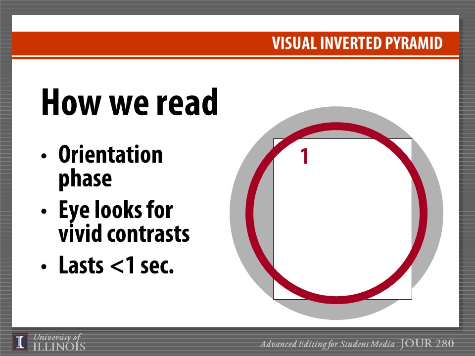
Readers are attracted by the visual vividness of an image — essentially, by how much it contrasts from the other items on the page. But this is a very fleeting attraction. The next thing they look for is information, and they seek it for the visual itself, any cutline or caption it may have, and the headline it is associated with. If those items fail to give them a reason to continue examining the package, they will go on to the next module on the page, without ever even reading the lead of the story. How effective do you think the DI’s Page 1 images were in conveying actual information?

All of journalism is about making choices — one thing is more important, another is less important. We should be hierarchically ranking everything and providing a clear indication of what to look at first, then second, then third. This is done not by position on the page as much as it is by differentiation in size of the modules containing that information and the headlines and visuals that are parts of those modules. The more equal in size headlines, modules and visuals are, the less effective they become.

Think “hen and chicks.” Each page should have one hen and a flock of chicks surrounding it.

Does each front page have each of the two primary focal points it needs to have?

The first is the lead story, usually with smaller art or no art. The story should disclose something unexpected and should have the largest, boldest headline on the page, typically somewhere in the upper right quadrant but typically not stretching all the way across the top of the page.

The second is the centerpiece package. It will have the page’s dominant visual — a single picture at least twice the size of any other photo on the page. Except in very rare cases, this will not also be the lead story. At least half of the visual must be in the top portion of the page, and there can be no module on the page — including everything that goes with this visual — that is larger than the visual itself.

The centerpiece may have story text going with it but it not required to so so. It is selected not for the value of the text but rather for the value of the image itself. An old file photo can never be a dominant visual.

All other positions on the page are considered secondary. One, which may or may not exist on any given page, is called the stripper or overplay. This treatment, stretching across the top of the page but not with the largest headline, typically is reserved for stories considered “good reads” — more interesting, perhaps, than the lead story or the centerpiece but not especially urgent and without a picture sufficient to be considered as the page’s dominant visual. Pages container strippers/overplays only when the news of the day suggests they would be appropriate. Unlike the lead and centerpiece, they are not required.

After checking out the front page, look at the inside pages. Are there stories or visuals on those pages that might have been more engaging than what was on the front page?

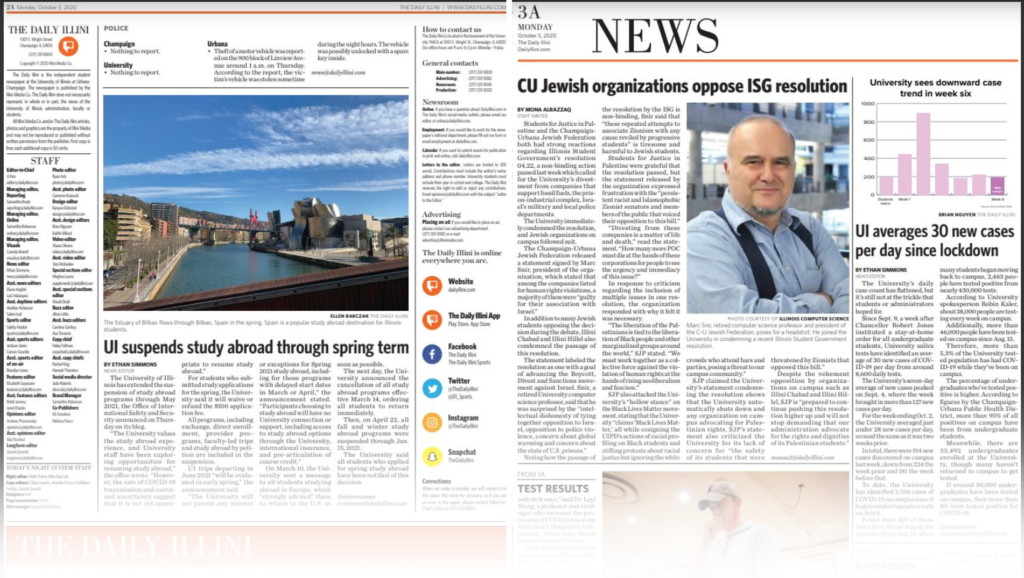
One thing to consider is whether content slotted to fit within a specific silo really deserved more prominent play. Whenever any organization creates separate subunits like individual sections of the paper, those in charge of those sections tend to become territorial. They want their material for their pages, even if it might be as good as if not better than what is on the front page. Are their hidden gems that might increase the paper’s “talk factor” that readers might not be finding because all they see on Page 1 are the “dull but important” stories?

Sometimes, stories that don’t make Page 1 fail to do so because of correctable weaknesses with the writing or the approach taken. Are there any stories, written too routinely as a stenographic announcement without a more engaging, human-focused lead, that might have had a chance to be elevated from inside sections to Page 1?

One thing worth noting throughout the paper is the absolute lack of standalone art, which is a staple of almost every news publication. Standalone art are feature photos that don’t have story text going with them. Everything necessary is told within the cutline. Standalone photos are a great way to “brighten” a paper and include interesting, if not terribly serious, feature content. They also allow “obligatory” coverage of events and the like to be created without having to occupy a reporter’s time covering the entire event and trying to find something newsworthy within it.

What missed opportunities for standalone feature photos do you see in the Monday and Thursday DIs? Think in terms of events you know were happening, oddball things you might have seen around campus, or various projects and activities that could use a minor update that would readers could get at least some modest engagement out of.

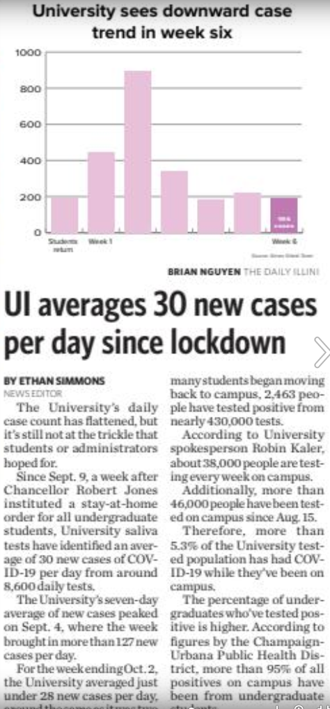
Let’s also look at infographics that appeared in the paper. Are they quickly and easily understood? Do they have a clear and significant main point? Are the statistics presented accurately and in a manner that doesn’t deceive, confuse or “spin” the topic needlessly. All graphics are important to evaluate, but I’m particularly interested in this one:

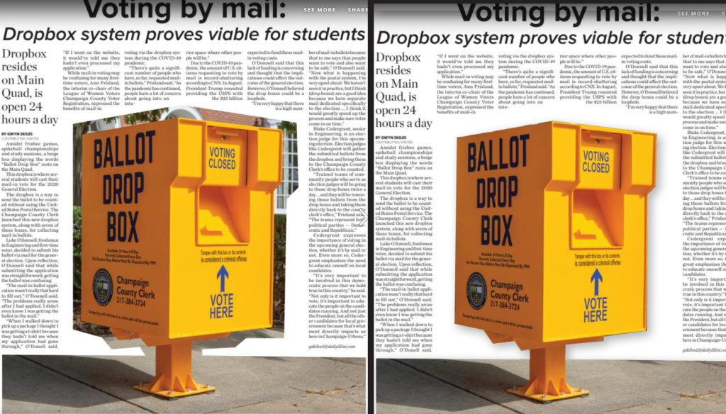
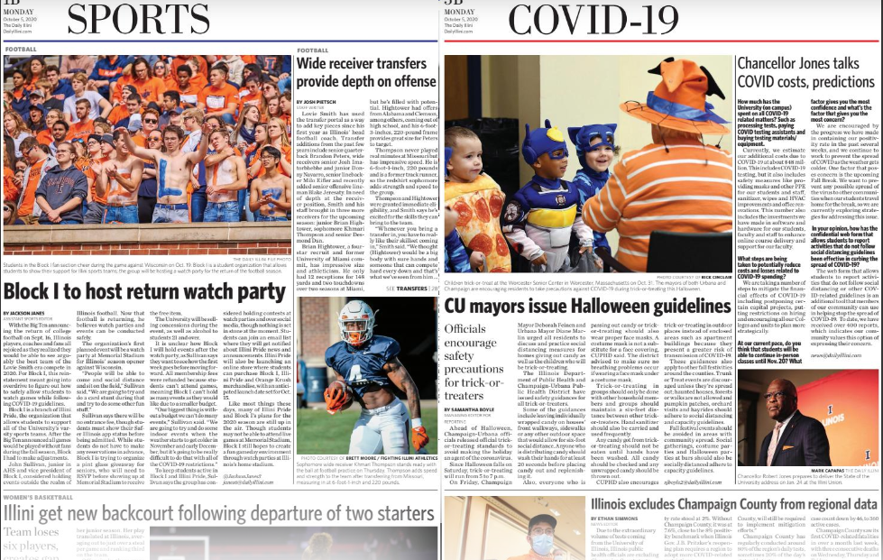
Finally, a technical point. If you’re going to do a blockout of a mugshot of a ballot box (left), why not finished the job (as done for you at right)?

Avoiding stenography

“You don’t write the truth. You write what people say!” 

— “Absence of Malice” (1981)

Techniques of contextualizing deconstructed elements of stories have the great advantage of avoiding stenographic journalism like that criticized in veteran editor Kurt Luedtke’s script for the 1981 film “Absence of Malice,” which definitely should be on the watch list for anyone interested in journalism.

Instead of relying on what people say about things, we can use real-world examples of the impact on actual, everyday people by humanizing stories and by adding storytelling rather than decorative visuals. Even more important, perhaps, we can get past political spin and make facts that otherwise would seem to bounce off our consciousness like meaningless details relevant and informative via charted data.

Both techniques allow us to avoid being merely an echo chamber for opinions and to create something other than commoditized content. In the age of myriad news and social media sites that play and replay the same old stuff, this is a way for us to stand out as an originator of valuable content not available anywhere else. That, in essence, is the ballgame in terms of success or failure as a news medium.

Most of our reporting courses do a fine job of introducing students to the need for finding human faces in textual or video stories. We probably need to do a bit more work about determining how to inject such storytelling into still visuals. However, the biggest gap in most young journalists’ education is in aggressively seeking to find stories via numbers, as David McCandless demonstrates in his TED talk above.

Yes, it’s true there are many in the world who regard truth as a malleable concept and who deride factual presentations as “lies, damned lies and statistics.” But part of the reason for this is that journalists, never known for their numeric literacy, do such a poor job communicating numbers, often falling victim to unscrupulous numbers spinners, that it’s difficult to trust what’s reported. The global news agency Reuters decries this in one of its reporting guides, which begins with the equation: “Numbers plus reporter equals error.”

We cannot, however, simply avoid the challenge by sticking with simplistic numbers out of context then decorating them up with various artistic techniques. We need to challenge ourselves to dig deeper and find ways to tell stories and to visually present those stories. The evidence about the power of visual storytelling is simply too great.

Take, for example, the 2007 Poynter Eye Track studies, which compared the effectiveness of three versions of the same newspaper page:

The page at left contained a linear narrative story with a not particularly storytelling photo — just something that showed what a passage within the story looked like. The middle one deconstructed the story more nonlinearly, adding more entry points of a factual nature. The right one eliminated linear narrative story text entirely, replacing it with largely statistically based factoids and data visualizations. Even though the visualizations weren’t especially good, the results were clear. After different readers were exposed to different versions of the page, a test of how much information they retained was administered. In aggregate, comprehension and recall increased dramatically the more the story employed techniques other than linear narrative.

This is the power of deconstruction, and one of the best ways to wield it is with contextualization in the form of visual representation of data.

Some stories are almost impossible to tell adequately without such techniques. The current pandemic is perhaps one of the best examples. This clearly is a numbers story with human faces, yet far too often we report numbers without clear context, without appropriate visualization and without adding human faces. We’re content to be mere stenographers of public pronouncements, and if that is all we do, nothing sets us apart from myriad other sources of information conveying exactly the same material.

So how do you accomplish more than this with a group of student journalists who, if they liked numbers more, would by north of Gregory or south of Green rather than hanging out in the innumerate middle of our campus?

The same way you get to Carnegie Hall as a musician — practice.

Take, for example, this rather simple set of data drawn from the university’s Campus Profile, a website every DI staffer ought to be fully familiar with:

Use the download link or click the table to download the data in Excel. Play around with the data, as we did in class Sept. 25. Within it are hints leading to stories — and some leading to dead ends. As data detectives, your job is to learn how to separate the potential wheat from the potential chaff. We played with these numbers a bit Sept. 25 and showed you how to start being a data detective with them. Your assignment for Oct. 2 will be to find some other story, and clear evidence for it, from elsewhere within the Campus Profile, and post a note with evidence of your findings to the Data category.

We also talked a bit Sept. 25 about how to present such data when they are found. Here’s the Powerpoint presentation discussed:

Begin thinking about not only what data to find but also about how it potentially might be presented and include a brief summary of that in the item you post for Oct. 2.

Finally, in a second assignment for Oct. 2, please separately post a thorough critique of the Sept. 28 print issue of the Daily Illini. Post it in the Critique category of this site. You’ll have to change from “Data” to “Critique” in the “Categories” menu at right during posting. We’ll review those critiques in class Oct. 2.

Becoming a productive team

If we’re going to engage readers, we first have to engage staffs charged with coming up with engaging coverage. To that end is this week’s brainstorming assignment: to post, in the Teamwork category, some specific ideas for ways in which intra-staff communication, workflow and engagement could be improved. Here’s some background on various models that may spark specific ideas:

Keep your eyes on the prize

All news organizations produce what basically can be divided into two types of content — expected and unexpected. Expected coverage involves events, games and announcements and even includes providing a forum for public opinion. It’s important. Consumers expect what you offer to be complete and comprehensive. If they find they cannot easily find every expected item in your product, they won’t rely on it habitually.

Expected content is, however, commodified. Consumers have multiple ways to glean the same information — by watching or attending an event or game, by dropping in on social media accounts, by reading announcements sent to them or by following various social media influencers, who have the added value — or curse, depending on your point of view — of being filtered by algorithm to include only the viewpoints with which they agree. If one or more alternative channels can deliver similar content with at least the same degree of predictable efficiency (more on that when we get to design), consumers will rely on those channels instead.

Aside from design, what ends up setting your product apart are the unexpected things it offers. These can be anything, We’re not talking about topics that appeal to particular demographics, as if you were marketing body wash. The power of enterprising coverage depends primarily on how tangible and real it seems — the oddities focused on; the emotional responses of real people conveyed; the outcries of interest, sympathy or protest created among readers by exploring virgin topics not yet covered elsewhere and therefore not already spun to death by various influencers.

Deconstruction and contextualization techniques discussed in last week’s assignment post may help lead you to these topics. The question then becomes how to ensure that the staff isn’t so overwhelmed with the expected that it cannot produce the unexpected, which ultimately will determine your product’s overall success or failure in terms of attracting a habitual audience once a base of expected content is ensured.

One technique is to refocus all planning on the end product. From the start, everyone involved should know whether any individual assignment is considered to be part of the routine, expected content; part of the enterprising, unexpected content; or something else. The “something else” content is essentially throwaways. Expected content must be done, but should consume no more time or human resources than minimally needed to get it concluded as quickly and efficiently as possible. Other content is what you pull out all stops to obtain.

Triaging potential content from the beginning is vitally important. So is sharing that initial triage assessment with all people involved, including reporters, photographers, graphic artists, copy editors, and page designers along with assignment and senior editors. The triaging needs to be dynamic. Stories may rise or fall in the triage hierarchy as newsgathering proceeds. But getting and keeping everyone on the same page helps ensure that human resources are expended appropriately.

Always envision the finished product

One prominent news consultant urges newsroom staffers to start with the headline and write it even before reporting begins. That’s a bit too structured and can lead to assignments becoming little more than echo chambers filled with confirmation bias. But the general concept does have merit. Constantly thinking what the headline would be at this point in the newsgathering process helps focus efforts as long as everyone understands that the current mock headline might change on the basis of more extensive reportage.

Photos, graphics and other design entry points, which we will discuss a bit later in the semester, absolutely depend on this type of approach, with everyone involved knowing from the start where each project is headed and working, even before all material is gathered, to ensure that what’s needed to tell the story in all forms is being gathered along with material that will appear only in text.

All of this has led most modern, enterprising newsrooms to adopt some sort of team planning for significant and even somewhat routine enterprise projects. Mario Garcia calls his approach W-E-D — writing, editing and design. Buck Ryan calls his the maestro concept. The Maynard Institute simply calls it team journalism. Each has a minor permutation or two, but all share some common traits.

The first is the absolute destruction of the old, assembly line approach to newsroom management. Expecting each desk or staffer to deal only with challenges brought to them as the next step along the way is an idea that was on its way out as early as the 1970s. The old method had an assignment editor send out a reporter, who then turned in his or her work and at that point sought to enlist a photographer or graphic designer. Whatever that group created, often without any internal consultation, would then be dropped on page designers, copy editors and headline writers without their ever having been involved in early phases of the project. The system was grossly inefficient, left staffers feeling anything but empowered and failed to encourage the bubbling up of ideas that would improve the product.

Our planning assignment from last week ought to have demonstrated the power of getting more people involved earlier. Lots of new and promising angles, which could be told by multiple means in addition to linear narrative text, emerged. In a team approach, it wouldn’t have been a matter of going back to various assignment editors to tell them to get one of their staffers to pursue some of these ideas as an adjunct to someone else’s project. You would have seen staffers taking ownership of their individual approaches to stories and working together with other staffers — without a lot of involvement by editors — in letting that creativity bubble up.

In their simplest form, all ideas involve assigning all personnel who ultimately might deal with any package to work together on that package, starting on Day 1. Each brings ideas on how to proceed, and each is charged with constantly keeping in mind a visualization of what the final product would look like if news-gathering efforts were to end at that moment. This helps keep everyone focused, ensures holes are plugged and reinforces the notion that the final product must actually say something relatively profound and unique that can be quickly summarized and grasped.

Each approach differs in the extent to which editors are involved. Generally, teams are limited to just one editor. Whether that person has power or is merely a facilitator varies. What the team approach is not is a star chamber of editors having a monopoly on ideas and farming them out to others who may not be as invested in the idea. This is an effort to put both authority and responsibility in the hands of lower level staffers and give them an opportunity to grow as journalists and model for others in the organization how cooperation can achieve superior results.

Make sure everyone knows

Triaging potential content from the beginning not only ensures engagement by all people involved, including reporters, photographers, graphic artists, copy editors, and page designers as well as assignment and senior editors. It also helps ensure that every issue has at least one enterprising piece to rely upon. True, stories may rise or fall in the triage hierarchy as news gathering proceeds. But one feature of this system is that it features a “Page 1 enterprise” box for every individual issue. If what was planned falls out of that box, something else from a future box — or a brand new idea — must come in to replace it.

One easy way to begin implementing ideas like these is to post all assignments to a centrally visible whiteboard or shared document and make each and every staffer consult that document or whiteboard to learn what his or her specific tasks might be. Instead of assigning staffers individually, they should have to at least glance through all the assignments for everyone so they can assess how important their individual role is for the next upcoming issue and can spot potential synergies with other staffers’ efforts.

Budget everything for a specific date. Never allow long-term projects to wait until they are finished before budgeting them for a specific date. You can always change the date if needed, but having a specific deadline ensure they won’t drag on unnecessarily, and they can be advanced if there suddenly is a blank spot in the “Page 1 enterprise” box for any upcoming issue.

Think of your role as that of a DJ or someone preparing a mix CD, if anyone still uses such things. You should know what each of the next 20 or more issues will have as their Page 1 enterprise, if all goes according to plan. It won’t, of course, but when that happens you rearrange the 19 other things you had planned so that you aren’t left with the print and online equivalent of dead air when what you had planned for a particular issue falls through.

Having a budget that stretches weeks or months into the future lets you and your staff visualize how things will come together. It’s a basic quality circle approach to supply chain management, and it’s just as useful in the news business as it is in other businesses.

Each approach differs in the extent to which editors are involved. Generally, teams are limited to just one editor. Whether that person has power or is merely a facilitator varies. What the team approach is not is a star chamber of editors having a monopoly on ideas and farming them out to others who may not be as invested in the idea. This is an effort to put both authority and responsibility in the hands of lower level staffers and give them an opportunity to grow as journalists and model for others in the organization how cooperation can achieve superior results.

Don’t discuss things non-productively

Newsrooms love to speculate about stories and story ideas. Too often the best “stories” never materialize at all. They are just talked to death within the newsroom. Endless speculation about where and what a story might be often can be resolved by doing the first 5% of the reporting before even bringing up the idea. Even if that first 5% reveals there’s no story where you thought there was one, the contacts made with sources might yield other ideas with greater likelihood of success.

Avoid putting blind, unresearched ideas on any budget. Avoid burning the entire availability of a staffer on an assignment the premise for which is uncertain or flawed. Do some reportorial sampling of each story before you commit to it, and consider doing this with visual personnel as well as textual personnel. They will quickly identify topics that are tangible enough to photograph or factual enough to chart, and the assessments they make can feed back into the team planning approach to enhance the idea.

Always keep in mind that news doesn’t happen in newsrooms or on Zoom conferences among editors. Making occasional “scratch the surface” assignments to informally see whether what you think is there actually is there can improve efficiency, result in more focused efforts and create additional tips like those a beat reporter might come up with merely by being in contact with sources.