Consider these three prototypes for the same news site:


Advanced Editing for Student Media
Consider these three prototypes for the same news site:
“You don’t write the truth. You write what people say!”
— “Absence of Malice” (1981)
Techniques of contextualizing deconstructed elements of stories have the great advantage of avoiding stenographic journalism like that criticized in veteran editor Kurt Luedtke’s script for the 1981 film “Absence of Malice,” which definitely should be on the watch list for anyone interested in journalism.
Instead of relying on what people say about things, we can use real-world examples of the impact on actual, everyday people by humanizing stories and by adding storytelling rather than decorative visuals. Even more important, perhaps, we can get past political spin and make facts that otherwise would seem to bounce off our consciousness like meaningless details relevant and informative via charted data.
Both techniques allow us to avoid being merely an echo chamber for opinions and to create something other than commoditized content. In the age of myriad news and social media sites that play and replay the same old stuff, this is a way for us to stand out as an originator of valuable content not available anywhere else. That, in essence, is the ballgame in terms of success or failure as a news medium.
Most of our reporting courses do a fine job of introducing students to the need for finding human faces in textual or video stories. We probably need to do a bit more work about determining how to inject such storytelling into still visuals. However, the biggest gap in most young journalists’ education is in aggressively seeking to find stories via numbers, as David McCandless demonstrates in his TED talk above.
Yes, it’s true there are many in the world who regard truth as a malleable concept and who deride factual presentations as “lies, damned lies and statistics.” But part of the reason for this is that journalists, never known for their numeric literacy, do such a poor job communicating numbers, often falling victim to unscrupulous numbers spinners, that it’s difficult to trust what’s reported. The global news agency Reuters decries this in one of its reporting guides, which begins with the equation: “Numbers plus reporter equals error.”
We cannot, however, simply avoid the challenge by sticking with simplistic numbers out of context then decorating them up with various artistic techniques. We need to challenge ourselves to dig deeper and find ways to tell stories and to visually present those stories. The evidence about the power of visual storytelling is simply too great.
Take, for example, the 2007 Poynter Eye Track studies, which compared the effectiveness of three versions of the same newspaper page:
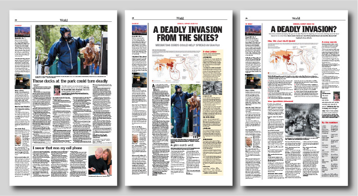
The page at left contained a linear narrative story with a not particularly storytelling photo — just something that showed what a passage within the story looked like. The middle one deconstructed the story more nonlinearly, adding more entry points of a factual nature. The right one eliminated linear narrative story text entirely, replacing it with largely statistically based factoids and data visualizations. Even though the visualizations weren’t especially good, the results were clear. After different readers were exposed to different versions of the page, a test of how much information they retained was administered. In aggregate, comprehension and recall increased dramatically the more the story employed techniques other than linear narrative.
This is the power of deconstruction, and one of the best ways to wield it is with contextualization in the form of visual representation of data.
Some stories are almost impossible to tell adequately without such techniques. The current pandemic is perhaps one of the best examples. This clearly is a numbers story with human faces, yet far too often we report numbers without clear context, without appropriate visualization and without adding human faces. We’re content to be mere stenographers of public pronouncements, and if that is all we do, nothing sets us apart from myriad other sources of information conveying exactly the same material.
So how do you accomplish more than this with a group of student journalists who, if they liked numbers more, would by north of Gregory or south of Green rather than hanging out in the innumerate middle of our campus?
The same way you get to Carnegie Hall as a musician — practice.
Take, for example, this rather simple set of data drawn from the university’s Campus Profile, a website every DI staffer ought to be fully familiar with:
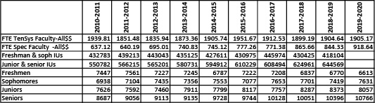
Use the download link or click the table to download the data in Excel. Play around with the data, as we did in class Sept. 25. Within it are hints leading to stories — and some leading to dead ends. As data detectives, your job is to learn how to separate the potential wheat from the potential chaff. We played with these numbers a bit Sept. 25 and showed you how to start being a data detective with them. Your assignment for Oct. 2 will be to find some other story, and clear evidence for it, from elsewhere within the Campus Profile, and post a note with evidence of your findings to the Data category.
We also talked a bit Sept. 25 about how to present such data when they are found. Here’s the Powerpoint presentation discussed:
Begin thinking about not only what data to find but also about how it potentially might be presented and include a brief summary of that in the item you post for Oct. 2.
Finally, in a second assignment for Oct. 2, please separately post a thorough critique of the Sept. 28 print issue of the Daily Illini. Post it in the Critique category of this site. You’ll have to change from “Data” to “Critique” in the “Categories” menu at right during posting. We’ll review those critiques in class Oct. 2.
If we’re going to engage readers, we first have to engage staffs charged with coming up with engaging coverage. To that end is this week’s brainstorming assignment: to post, in the Teamwork category, some specific ideas for ways in which intra-staff communication, workflow and engagement could be improved. Here’s some background on various models that may spark specific ideas:
All news organizations produce what basically can be divided into two types of content — expected and unexpected. Expected coverage involves events, games and announcements and even includes providing a forum for public opinion. It’s important. Consumers expect what you offer to be complete and comprehensive. If they find they cannot easily find every expected item in your product, they won’t rely on it habitually.
Expected content is, however, commodified. Consumers have multiple ways to glean the same information — by watching or attending an event or game, by dropping in on social media accounts, by reading announcements sent to them or by following various social media influencers, who have the added value — or curse, depending on your point of view — of being filtered by algorithm to include only the viewpoints with which they agree. If one or more alternative channels can deliver similar content with at least the same degree of predictable efficiency (more on that when we get to design), consumers will rely on those channels instead.
Aside from design, what ends up setting your product apart are the unexpected things it offers. These can be anything, We’re not talking about topics that appeal to particular demographics, as if you were marketing body wash. The power of enterprising coverage depends primarily on how tangible and real it seems — the oddities focused on; the emotional responses of real people conveyed; the outcries of interest, sympathy or protest created among readers by exploring virgin topics not yet covered elsewhere and therefore not already spun to death by various influencers.
Deconstruction and contextualization techniques discussed in last week’s assignment post may help lead you to these topics. The question then becomes how to ensure that the staff isn’t so overwhelmed with the expected that it cannot produce the unexpected, which ultimately will determine your product’s overall success or failure in terms of attracting a habitual audience once a base of expected content is ensured.
One technique is to refocus all planning on the end product. From the start, everyone involved should know whether any individual assignment is considered to be part of the routine, expected content; part of the enterprising, unexpected content; or something else. The “something else” content is essentially throwaways. Expected content must be done, but should consume no more time or human resources than minimally needed to get it concluded as quickly and efficiently as possible. Other content is what you pull out all stops to obtain.
Triaging potential content from the beginning is vitally important. So is sharing that initial triage assessment with all people involved, including reporters, photographers, graphic artists, copy editors, and page designers along with assignment and senior editors. The triaging needs to be dynamic. Stories may rise or fall in the triage hierarchy as newsgathering proceeds. But getting and keeping everyone on the same page helps ensure that human resources are expended appropriately.
One prominent news consultant urges newsroom staffers to start with the headline and write it even before reporting begins. That’s a bit too structured and can lead to assignments becoming little more than echo chambers filled with confirmation bias. But the general concept does have merit. Constantly thinking what the headline would be at this point in the newsgathering process helps focus efforts as long as everyone understands that the current mock headline might change on the basis of more extensive reportage.
Photos, graphics and other design entry points, which we will discuss a bit later in the semester, absolutely depend on this type of approach, with everyone involved knowing from the start where each project is headed and working, even before all material is gathered, to ensure that what’s needed to tell the story in all forms is being gathered along with material that will appear only in text.
All of this has led most modern, enterprising newsrooms to adopt some sort of team planning for significant and even somewhat routine enterprise projects. Mario Garcia calls his approach W-E-D — writing, editing and design. Buck Ryan calls his the maestro concept. The Maynard Institute simply calls it team journalism. Each has a minor permutation or two, but all share some common traits.
The first is the absolute destruction of the old, assembly line approach to newsroom management. Expecting each desk or staffer to deal only with challenges brought to them as the next step along the way is an idea that was on its way out as early as the 1970s. The old method had an assignment editor send out a reporter, who then turned in his or her work and at that point sought to enlist a photographer or graphic designer. Whatever that group created, often without any internal consultation, would then be dropped on page designers, copy editors and headline writers without their ever having been involved in early phases of the project. The system was grossly inefficient, left staffers feeling anything but empowered and failed to encourage the bubbling up of ideas that would improve the product.
Our planning assignment from last week ought to have demonstrated the power of getting more people involved earlier. Lots of new and promising angles, which could be told by multiple means in addition to linear narrative text, emerged. In a team approach, it wouldn’t have been a matter of going back to various assignment editors to tell them to get one of their staffers to pursue some of these ideas as an adjunct to someone else’s project. You would have seen staffers taking ownership of their individual approaches to stories and working together with other staffers — without a lot of involvement by editors — in letting that creativity bubble up.
In their simplest form, all ideas involve assigning all personnel who ultimately might deal with any package to work together on that package, starting on Day 1. Each brings ideas on how to proceed, and each is charged with constantly keeping in mind a visualization of what the final product would look like if news-gathering efforts were to end at that moment. This helps keep everyone focused, ensures holes are plugged and reinforces the notion that the final product must actually say something relatively profound and unique that can be quickly summarized and grasped.
Each approach differs in the extent to which editors are involved. Generally, teams are limited to just one editor. Whether that person has power or is merely a facilitator varies. What the team approach is not is a star chamber of editors having a monopoly on ideas and farming them out to others who may not be as invested in the idea. This is an effort to put both authority and responsibility in the hands of lower level staffers and give them an opportunity to grow as journalists and model for others in the organization how cooperation can achieve superior results.
Triaging potential content from the beginning not only ensures engagement by all people involved, including reporters, photographers, graphic artists, copy editors, and page designers as well as assignment and senior editors. It also helps ensure that every issue has at least one enterprising piece to rely upon. True, stories may rise or fall in the triage hierarchy as news gathering proceeds. But one feature of this system is that it features a “Page 1 enterprise” box for every individual issue. If what was planned falls out of that box, something else from a future box — or a brand new idea — must come in to replace it.
One easy way to begin implementing ideas like these is to post all assignments to a centrally visible whiteboard or shared document and make each and every staffer consult that document or whiteboard to learn what his or her specific tasks might be. Instead of assigning staffers individually, they should have to at least glance through all the assignments for everyone so they can assess how important their individual role is for the next upcoming issue and can spot potential synergies with other staffers’ efforts.
Budget everything for a specific date. Never allow long-term projects to wait until they are finished before budgeting them for a specific date. You can always change the date if needed, but having a specific deadline ensure they won’t drag on unnecessarily, and they can be advanced if there suddenly is a blank spot in the “Page 1 enterprise” box for any upcoming issue.
Think of your role as that of a DJ or someone preparing a mix CD, if anyone still uses such things. You should know what each of the next 20 or more issues will have as their Page 1 enterprise, if all goes according to plan. It won’t, of course, but when that happens you rearrange the 19 other things you had planned so that you aren’t left with the print and online equivalent of dead air when what you had planned for a particular issue falls through.
Having a budget that stretches weeks or months into the future lets you and your staff visualize how things will come together. It’s a basic quality circle approach to supply chain management, and it’s just as useful in the news business as it is in other businesses.
Each approach differs in the extent to which editors are involved. Generally, teams are limited to just one editor. Whether that person has power or is merely a facilitator varies. What the team approach is not is a star chamber of editors having a monopoly on ideas and farming them out to others who may not be as invested in the idea. This is an effort to put both authority and responsibility in the hands of lower level staffers and give them an opportunity to grow as journalists and model for others in the organization how cooperation can achieve superior results.
Newsrooms love to speculate about stories and story ideas. Too often the best “stories” never materialize at all. They are just talked to death within the newsroom. Endless speculation about where and what a story might be often can be resolved by doing the first 5% of the reporting before even bringing up the idea. Even if that first 5% reveals there’s no story where you thought there was one, the contacts made with sources might yield other ideas with greater likelihood of success.
Avoid putting blind, unresearched ideas on any budget. Avoid burning the entire availability of a staffer on an assignment the premise for which is uncertain or flawed. Do some reportorial sampling of each story before you commit to it, and consider doing this with visual personnel as well as textual personnel. They will quickly identify topics that are tangible enough to photograph or factual enough to chart, and the assessments they make can feed back into the team planning approach to enhance the idea.
Always keep in mind that news doesn’t happen in newsrooms or on Zoom conferences among editors. Making occasional “scratch the surface” assignments to informally see whether what you think is there actually is there can improve efficiency, result in more focused efforts and create additional tips like those a beat reporter might come up with merely by being in contact with sources.
Two techniques often are useful in planning and presenting news coverage. They go by many names, but for our purposes we’ll call them deconstructing and conceptualizing stories.
Deconstruction means identifying all potential aspects of a topic, especially the different questions, opinions or facts that diverse sets of readers might want to explore.
Every reader is unique. Each will assign differing levels of personal relevance to different aspects of the same story. Some aspects — relatively rarely — may impact their lives directly. Others — more commonly — may seem odd, outrageous, humorous, reaffirming, challenging or otherwise worthy of attention, if for no other reason than to provide material for conversations.
Regularly talking to and interacting with diverse readers — not necessarily when working on a project but as a matter of course in daily life — helps. Learning to identify each separate aspect that might have personal relevance to at least some of your readers helps you plan coverage.
Grouping topics that require similar sourcing helps determine how to deploy reporters, each of them to tackle more attainable aspects of a major larger story, which might elude a single reporter because of its complexity.
Within each individual reporter’s efforts, question outlines — a form of deconstruction — help ensure that the reporter follows up on all necessary aspects and doesn’t become so awestruck with one or two key quotes that additional angles aren’t pursued.
In presentation and design, deconstruction helps determine where entry points — separate headlines, photos, graphics, pull quotes, etc. — might be needed and emphasizes content over art in creating those entry points.
So-called “long form” coverage may impress journalism professors and writers. It may even get a few readers — the handful who actually make it all the way to the end of a piece — to say that they feel more satisified. From an informational perspective, however, web metrics and web and print eye-tracking reveal it’s very nearly the worst way to present information.
Far more effective than a linear narrative, “my way or the highway” approach to storytelling is to deconstruct a complicated piece into its non-linear components — multiple smaller inverted pyramids, each appealing to a different audience segment, instead of a single big one that appeals to just some readers.
Some regard this as a dumbing-down of news. In fact, non-linear storytelling typically requires greater depth than do long-form linear narratives. In linear narrative, it’s easy to gloss over aspects by fudging them in general terms and letting the beauty of writing or presentation hide the lack of facts to support. Think of which is harder: writing a long answer on an essay exam or answering the same question with a bulleted list. Long essays allow for bullshitting. Bullet points reveal whether you know the answer or don’t. The adage about if you had more time you would have written something shorter comes to mind.
The stakes are enormous. Economically, success in media depends upon habituation, not on the value of an individual commoditized piece of content. The more quickly and easily a reader expects to be able to locate exactly what aspects of stories are of greatest interest to him or her, the greater the chance that he or she will habitually return to that news source in the future.
Deconstruction and non-linear presentation of deconstructed material ensures that a more diverse audience will have greater expectation that something at least minimally satisfying is regularly present whenever they might check your mediated news product.
As a first step in learning how to deconstruct stories, take as an example current efforts to address the pandemic at the University of Illinois. Try creating a diagram, somewhat along the lines of the one below, that can serve as an outline of the different aspects of the story that need to be checked upon.
The example is about the first- and second-day coverage of the April 1995 bombing of the Murrah Federal Building in Oklahoma City.
Imagine you are a reader, attempting to learn what you might care most about regarding that story at that time. Follow the various categorical labels — when eventually would be turned into hierarchical entry points — in the flow chart below and see how you traverse the maze of coverage in what has been referred to a spaghetti bowl of hypertext:

Note how three main paths into the story are created — a spot news path about the investigation and arrest of a suspect, more of a policy path about the implications of domestic terrorism and finally a featurized path setting the scene of the destruction.
See how these paths unfold into detailed sections that include local impact, examples, data lists, and many other elements. This not only guides reporting but also offers opportunities for images, graphics and other data structures that can do more than merely repeat what’s already said as the main points of text. In some cases, in fact, text isn’t even needed. Visuals, graphics, lists and the like can substitute while text is used to convey information best told in linear narrative fashion while other elements of the story can be presented as they are best told, via various design and data elements.
This is clearly an overly simplistic look at how a very complicated story of this nature would be presented, but if you follow the spaghetti lines the way you would consume the story yourself, then compare how another person would follow the paths differently, you may begin to get the idea of how non-linear storytelling works and why it helps ensure there’s something for everyone in the finished package.
A huge criticism of journalism is that it has become purely stenographic. All we do is look for people to comment on or characterized developments. We don’t attempt to find truth. We attempt to find “spin” and balance one set of spin with another set of spin.
Contextualizing means putting human faces to as much of what we cover as possible. Not only is it easier for readers to become engaged in a story if they can see tangible impact on everyday people like them. It also is a powerful fact-checking mechanism. Any source claiming that some action does something is nothing more than a talking head if he or she cannot point to specific individuals actually experiencing whatever they claim.
The mantra here is real people doing real things. By definition, officials are not real people — not even officials of some advocacy group like protestors. They’re fake talking heads whose primary goal is to create spin rather than let readers vicariously experience what the speakers are talking about — provided, of course, whatever it is actually exists.
Finding real people doing real things not only fact-checks the story. It also inherently diversifies the list of sources. We no longer accept only the versions of truth of the largely homogenous group of people who have power but are relying on seeing actual impacts, not just hearing from a representative cross-section of society as a whole.
Finding human faces allows us to create impactful, inductive (rather than deductive) leads, going from tangible specifics to less relatable generalities, and helps identify subjects to photograph or show by video. But that’s not the only way we contextualize.
Context also is needed with statistics. A number by itself is meaningless. Numbers take on meaning only when compared to other numbers from similar situations. This may involve comparing one locality to another, current data with past data, an unfamiliar situation with a similar but more familiar one. It’s not just a single number vs. another number. It’s the pattern of how numbers change and whether they change in response to whatever seems to be causing them.
It is rare to actually be able to prove causation with numbers, but it is possible — and necessary — to explore them more fully to determine whether some alternative cause might explain something better. It is, therefore, vitally important to know everything you can about any set of numbers reported — not just the portion of numbers you might choose to relay to readers. You need to know details of how the numbers were gathered, what limitations are inherent in such methodology, and look for anomalies that might explain false impressions numbers can create.
Charted numbers, as opposed to merely reported numbers, are particularly powerful as they allow the reader to create his or her own context for them, provided sufficient numbers are provided to allow for this process. That’s why it’s always important to show the featured pattern of numbers in context of a comparison set of past numbers or numbers from other situations. The reader subconsciously invests of himself or herself in validating the true meaning of the numbers and essentially creates his or her own personal spin, rather than having someone else’s spin forced upon him or her.
Context — both human and statistical — will play significant roles in how to deconstruct the U of I pandemic story. Look for specific areas in which human faces or statistical comparisons might shed light on the overall story and include them in our outline.
Never assume that what we are talking about when we refer to a “story” is the text of that story. Every element of the final package — the headlines, photos, graphics, lists, databases, pull quotes, interactives and other entry points — all combine to tell the story. Various pieces of text within the package are just one element of the story. Journalists gathering information constantly need to think about gathering material other than what works particularly well in linear narrative text.
Capitalizing on reporters’ undue focus on linear narrative structures is one of the ways devious public relations professionals use to keep journalists away from probing too closely for the truth. Give a reporter a sexy sound bite or a killer quote for the second paragraph and the reporter generally will go away, thinking he or she has done all that’s necessary. Adopting strategies and encouraging practices that refuse to reward such behavior is one of the goals of looking at stories through the lens of deconstruction and conceptualization.
Once you have a draft of your plan (significantly more fleshed out than the Oklahoma City example) for the pandemic story, post it to this site in the Planning category, then come to class Friday having looked at each other’s plans and being prepared to discuss them.