- I feel like the stories on A1 in Monday’s paper were more so selected for the topics that they represent. I think the most surprising thing on the page would be the “Test return times down to eight hours” because that is something that affects the day to day lives of students.
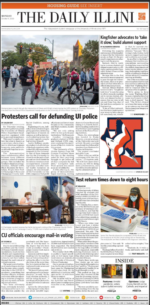
- For the visuals on the page, I really like the protest photo. It shows people in action, in the streets protesting. As for the rest of the photos, they’re pretty generic, but then again there are only so many ways we can capture COVID testing.
- For the primary focal points, I guess I’ve always been told (by previous editors) that each story always has to have art. I can definitely put more effort into creating more of a lead story rather than just big art. Before this class I kind of thought that the biggest art should be with the biggest story, but now I know that that’s not necessarily the case.
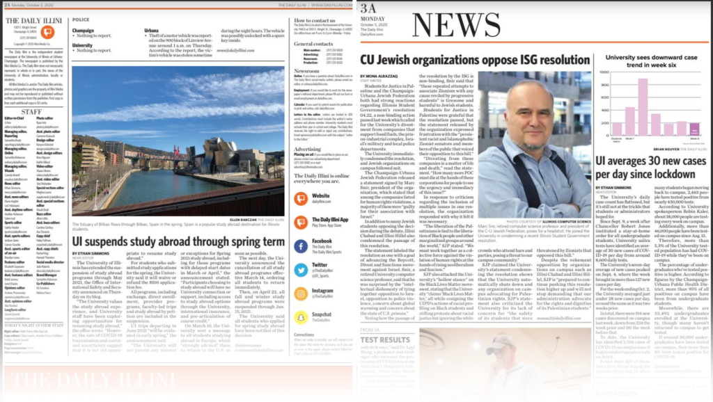
- For the stories on A2 and A3, I feel like the study abroad story is pretty impactful, because I know I had heard about some people who were optimistic about studying abroad in the spring. This would be big news to someone like them.
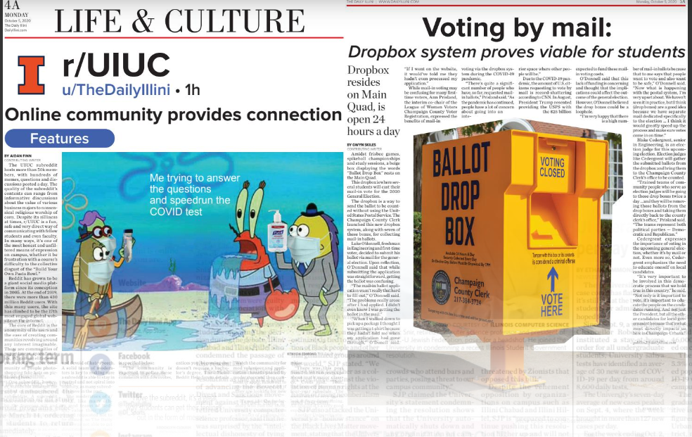
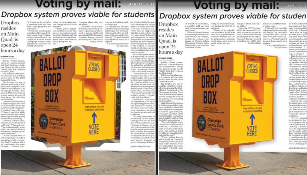
- I think the “hidden gem” this week was definitely features. I agree that the clipping of the ballot box could have been closer. I like what you did as an alternative. I think I was just trying to go for a collage-type look. I really liked the Reddit-themed page too. Last week’s class kind of inspired me to be a little more creative with these pages. I want to carry that over to the rest of the paper (maybe not the same as features, but something similar).
- Maybe for the Block I story, it could focus on one of the people who’s organizing the event. The halloween COVID story could possibly include interviews from parents or children in the community to create more of people-centered article rather than an information only-centered article.
- Although there isn’t a whole lot of action, I think the photo of the pre-packaged meals on A1 could possibly stand on its own. Perhaps a different version of this concept. It’d be cool to get a picture of people grabbing the meals to show what the COVID-era dining room experience is like.
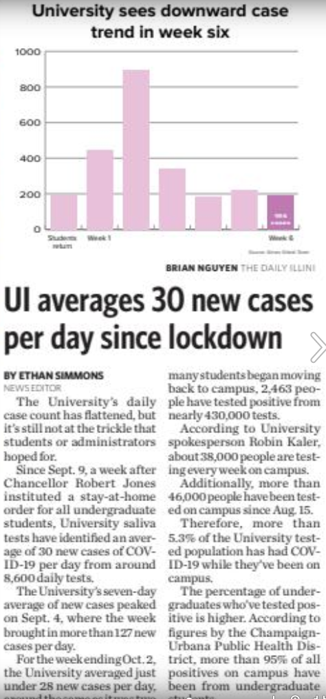
- The infographic was admittedly way too small to really understand without having to squint. If it were more visible (apologies for this), I think it would be easy to understand.
Analyzing an issue
We’re going to do another critique of the DI for this week’s class, but this time we’re going to do it with some key questions to answer, and we’re going to apply those questions to both the Monday issue and the Thursday issue. So critique both, and make sure you answer these questions when you post your comments in the Critique category of this site:
Metrics confirm that readers are most likely to appreciate stories that are somehow unexpected.
Are these four stories the ones that are most likely to somehow surprise readers? Or were they selected more because of the topics they represent?
Content selection by topic rather than development is a strategy based in advertising and marketing, not journalism, and generally does not encourage the type of habitual readership a news organization requires to be successful.
After analyzing what content was selected for Page 1, analyze how it was presented. Visual elements should not merely illustrate what something looks like; they should not say only what something is about. They should actually tell a new and surprising development of the story.
Readers are attracted by the visual vividness of an image — essentially, by how much it contrasts from the other items on the page. But this is a very fleeting attraction. The next thing they look for is information, and they seek it for the visual itself, any cutline or caption it may have, and the headline it is associated with. If those items fail to give them a reason to continue examining the package, they will go on to the next module on the page, without ever even reading the lead of the story. How effective do you think the DI’s Page 1 images were in conveying actual information?
All of journalism is about making choices — one thing is more important, another is less important. We should be hierarchically ranking everything and providing a clear indication of what to look at first, then second, then third. This is done not by position on the page as much as it is by differentiation in size of the modules containing that information and the headlines and visuals that are parts of those modules. The more equal in size headlines, modules and visuals are, the less effective they become.
Think “hen and chicks.” Each page should have one hen and a flock of chicks surrounding it.
Does each front page have each of the two primary focal points it needs to have?
The first is the lead story, usually with smaller art or no art. The story should disclose something unexpected and should have the largest, boldest headline on the page, typically somewhere in the upper right quadrant but typically not stretching all the way across the top of the page.
The second is the centerpiece package. It will have the page’s dominant visual — a single picture at least twice the size of any other photo on the page. Except in very rare cases, this will not also be the lead story. At least half of the visual must be in the top portion of the page, and there can be no module on the page — including everything that goes with this visual — that is larger than the visual itself.
The centerpiece may have story text going with it but it not required to so so. It is selected not for the value of the text but rather for the value of the image itself. An old file photo can never be a dominant visual.
All other positions on the page are considered secondary. One, which may or may not exist on any given page, is called the stripper or overplay. This treatment, stretching across the top of the page but not with the largest headline, typically is reserved for stories considered “good reads” — more interesting, perhaps, than the lead story or the centerpiece but not especially urgent and without a picture sufficient to be considered as the page’s dominant visual. Pages container strippers/overplays only when the news of the day suggests they would be appropriate. Unlike the lead and centerpiece, they are not required.
After checking out the front page, look at the inside pages. Are there stories or visuals on those pages that might have been more engaging than what was on the front page?
One thing to consider is whether content slotted to fit within a specific silo really deserved more prominent play. Whenever any organization creates separate subunits like individual sections of the paper, those in charge of those sections tend to become territorial. They want their material for their pages, even if it might be as good as if not better than what is on the front page. Are their hidden gems that might increase the paper’s “talk factor” that readers might not be finding because all they see on Page 1 are the “dull but important” stories?
Sometimes, stories that don’t make Page 1 fail to do so because of correctable weaknesses with the writing or the approach taken. Are there any stories, written too routinely as a stenographic announcement without a more engaging, human-focused lead, that might have had a chance to be elevated from inside sections to Page 1?
One thing worth noting throughout the paper is the absolute lack of standalone art, which is a staple of almost every news publication. Standalone art are feature photos that don’t have story text going with them. Everything necessary is told within the cutline. Standalone photos are a great way to “brighten” a paper and include interesting, if not terribly serious, feature content. They also allow “obligatory” coverage of events and the like to be created without having to occupy a reporter’s time covering the entire event and trying to find something newsworthy within it.
What missed opportunities for standalone feature photos do you see in the Monday and Thursday DIs? Think in terms of events you know were happening, oddball things you might have seen around campus, or various projects and activities that could use a minor update that would readers could get at least some modest engagement out of.
Let’s also look at infographics that appeared in the paper. Are they quickly and easily understood? Do they have a clear and significant main point? Are the statistics presented accurately and in a manner that doesn’t deceive, confuse or “spin” the topic needlessly. All graphics are important to evaluate, but I’m particularly interested in this one:
Finally, a technical point. If you’re going to do a blockout of a mugshot of a ballot box (left), why not finished the job (as done for you at right)?
Data from campus profile
I thought the most interesting thing that I could find was about assistants (teaching assistants, research assistants, graduate assistants). For teaching assistants (954.42 to 1171.67 from the 2010-11 school year to the 2019-20 school year) and research assistants (86.47 to 151.21 from the 2010-11 school year to the 2019-20 school year), their numbers have gone up dramatically. For graduate assistants, they have gone down considerably in the same time period (101.94 to 48.22). I’m curious about this change. I think that the GEO strike could definitely have affected the change in the graduate assistants.
Paper Critique
Front picture is too big and missing an action. I like that it shows real people and is at the testing site, but I think it would have looked better if the people were doing something with their hands instead of sitting/standing idly.
I don’t really like starting the headline with the word “about”. I think headlines should be more direct. Might just be a personal preference.
Center picture on the front page looks to be a good size and is interesting to me. Lots of people all doing something.
The picture of the TPUSA speaker looks kind of awkward to me but maybe that is the best we can do when all of the speakers give speeches over Zoom calls.
Packed bar on page 2 is interesting to me, as well as the overhead shot of KAMS to see their upper floor.
Story on 3A is interesting, as well as the picture of the mask with the words wrapped around. The headshot of the professor seems pretty big and boring though.
4A zoom call picture is interesting and goes with the story well, but I don’t like that the club’s graphic is so big and prominent. Comes off as kind of like PR, but might just be my opinion.
Graphics for the voting story look appealing.
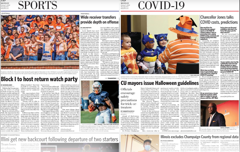
I feel like i’ve seen the image of Chancellor Jones on 3B a bunch of times throughout the last couple months.
Images for sports and opinions worked well and looked interesting, but maybe that just comes with sports having a lot of action shots and having to use archive pictures at the moment.